With almost everyone owning a smartphone or tablet, Amazon shoppers are using the mobile platform now more than ever. Believe it or not, Amazon merchant, around 60% of Amazon purchases happen on mobile devices!
Amazon Merchants Often Forget...
In light of this information, brand owners must optimize their product listings for both the Amazon website and the mobile app. We've talked with 1,000's of companies selling on Amazon. The majority of them create their product listings on a laptop or desktop computer. Often, they forget to review the listing from a mobile device. Mobile devices have smaller screens. So, your listing will appear differently on the Amazon app.
Most importantly, shoppers can't view the product information (title, bullet points, product description, etc.) all at once, like on Amazon's website. Keeping this in mind when creating or updating your listing is extremely important. This way, you'll ensure ease-of-read on both platforms.
Also note that if you sell a significant amount of revenue on your e-commerce website such as Shopify, you can apply the same lessons.
Noticeable Differences
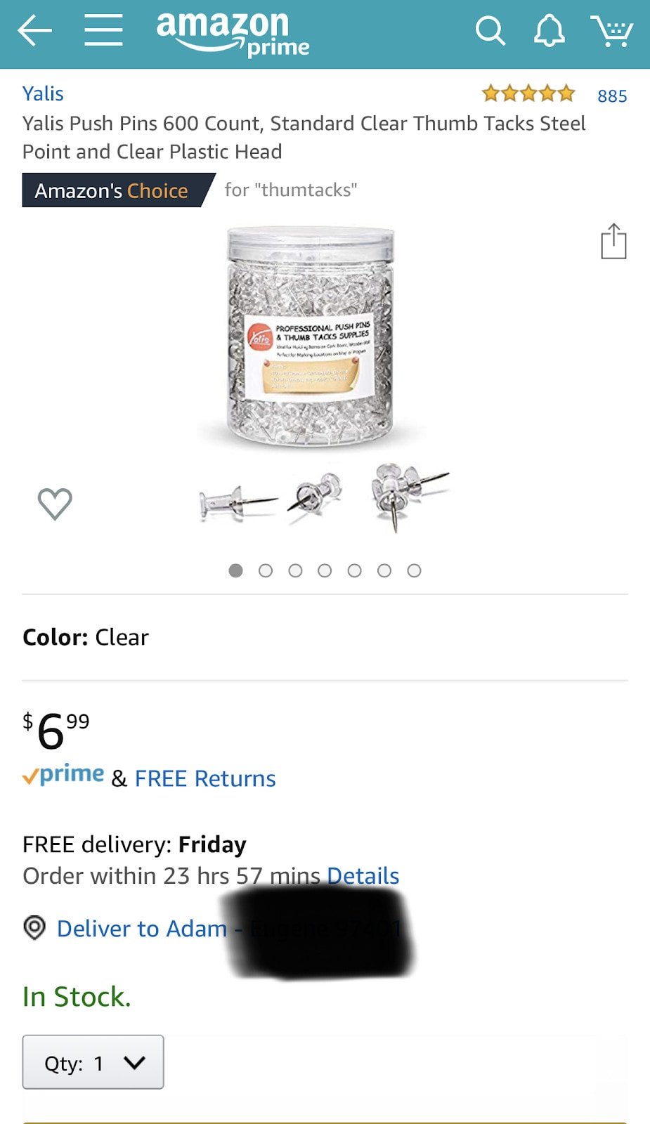
For this example, we'll use a simple product listing. It's one of my frequently-purchased Amazon items - thumbtacks! (Yeah, I know… tacky, right?) Feel free to follow along on your smartphone and computer!
Amazon Mobile Listing
Amazon Website Listing
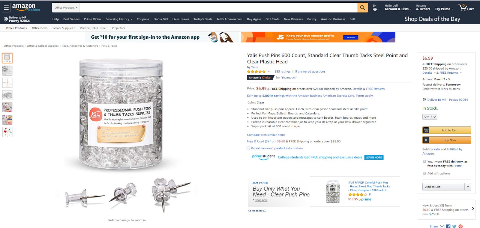
I also recommend that you pull up your own product listing on both mobile and a computer to compare. Then adjust your listing to boost your conversion rates and sales accordingly!
Let’s Tweak That Listing
Now that we have clear images of the same Amazon listing on mobile and desktop let's start with some specific differences.
Your Title
Depending on the length of your title, it can appear as "condensed," or abbreviated on the Amazon Mobile app. Just because the whole title is showing on both screenshots above, doesn't mean that it can't happen to your listing. As always, make sure the most important information (and keywords) appear at the beginning of your title. If your title is being "cut-off" on the Amazon app, you'll want to see exactly where. Ask yourself these questions:
- Is my title still making sense and easy to understand?
- Are the most important features of my product still included in my mobile app listing title?
- Is the visible part of my title (mobile) still explaining what my product is, and why a customer needs it?
If you answered "no" to any of the questions above, adjust your title accordingly.
Your Images
As you can see above, shoppers can swipe to view images for product listings on the Amazon app. Flip back and forth between platforms. You'll likely notice that the zoom feature only pops up if the customer clicks into the image on Amazon's mobile platform. Keep this in mind when creating your images—especially those with diagrams, infographics, or small text. The extra step to access the zoom feature means small text can be difficult to read. Shoppers may not be able to read the text at all. The same goes for infographics, diagrams, or any side-feature you may have included in your images.
Amazon Merchant Pro Tip:
Another vital difference to note is that all images may not show up on mobile. To get the most conversions, make sure to order your images strategically. You'll want to include your strongest images in the front of the listing to make sure they appear on mobile as well. Our team believes in having a lifestyle followed by an infographic. Then, continue this trend throughout the image block. When it comes to optimizing images, ask yourself these questions:
- Are my strongest images at the front of my image block?
- Is all text, including diagrams and infographics, clearly readable on the Amazon app?
- Do all my images appear clearly on both the Amazon desktop and mobile app platforms?
If you answered "no" to any of these questions, consider making adjustments to your images.
Your A+ Content
If you're following along on your mobile device, one of the main differences you'll notice immediately is that a listing's A+ Content appears before the bullet points at the time of this writing. With this in mind, you'll want to make sure you have the strongest A+ Content possible. That way, mobile users get a complete understanding of your product and its features. You can use this difference to your advantage by building strong A+ Content. That'll help paint a picture in a customer's mind almost immediately into viewing your listing, assuming that the customer is viewing on mobile. Remember, many people are visual learners. So, optimizing your A+ Content on mobile and desktop platforms is essential for conversions.
Amazon Merchant Pro Tip:
Another subtle difference that may or may not occur on your listing is spacing. With A+ Content appearing as "condensed" on mobile, this can affect the spacing between images, texts, and other details. When optimizing your A+ Content, ask yourself these questions:
- Is my A+ Content legible and clearly understood on both the Amazon website and mobile app?
- Does my A+ Content accurately portray my product and its features?
- Is my A+ Content spacing on Amazon's website consistent with how it appears on the mobile app?
If you answered "no" to any of these questions, adjust your A+ Content accordingly.
Your Bullet Points
Bullet points are one of the most important aspects of an Amazon product listing. This is where you'll explain your product and its features. Plus, you'll explain why a viewer needs your product. As I'm sure you've noticed, bullet points appear directly below the title on Amazon's desktop platform. This makes it easy for viewers to gain a clear understanding of your product. Your A+ Content's placement (on mobile) can give you an advantage. But locating the bullet points on the Amazon mobile app can be challenging for some. The bullet points will appear below your A+ Content. Make sure your bullet points are detailed, organized, and readable. That will help make sure customers know everything about your product. Well, not everything… just the most-important stuff!
Amazon Merchant Pro Tip:
When creating your bullet points, make sure your first three include the most important information about your product. For example, you may want to consider moving your warranty or guarantee to the third bullet point instead of the fifth. This ensures your customers understand their return options without having to dig through the product listing. When optimizing your bullet points, ask yourself these questions:
- Are my bullet points clear, concise, and easy to read?
- Is the most important information included in my top 3 bullet points?
- Is my guarantee/warranty info showing on the Amazon mobile app?
If you answered "no" to any of these questions, consider making adjustments to your bullet points.
In Conclusion…
Amazon is one of the largest online marketplaces in the world. While many users visit Amazon via desktop, the majority of users are now accessing the Amazon Marketplace via smartphone or tablet. The number of mobile users will only grow as technology advances. So, optimizing your listing for both mobile and desktop platforms is essential for maximizing your sales and overall product success on Amazon. Keeping what we've learned in-mind, make strategic adjustments to your listing. This will improve your customers' experience when viewing your listings on their mobile devices and their computer. That should, hopefully, increase conversions.
Keep in mind that Amazon is also always making changes to how listings appear in mobile and desktop computers. So we recommend that you do a quarterly check of all your listings. That'll help you make sure your listings look as strong as possible.
You've gained knowledge of the differences between the Amazon mobile and desktop platforms. Now it's time for you to start optimizing for both platforms. The power is in your hands… What will you do with it?
Thanks for reading! Please visit www.TurnKeyProductManagement.com for free resources or to learn how TurnKey can help scale your business. If you want TurnKey to personally audit or optimize your product listings for mobile and desktop, contact them to learn how!
Jeff and Jenna Lieber from TurnKey Product Management provided this article. TurnKey is an Amazon consulting company that sells over 8-figures in revenue for its clients each year. Whether you're just starting or are an expert Amazon merchant, we can help take your business to the next level. Visit www.TurnKeyProductManagement.com. You'll find free resources, and you can learn how TurnKey can help scale your business.
